The WYSIWYG (What You See Is What You Get) editor that is available to edit web pages on your website as well as in other places in your services, gives you a familiar word-processing style interface to use when editing articles and other content. You do not need to learn HTML or CSS. We can also help you with advice and guidance on either of those if you have questions. Below is the editor you see.
Where do I find it?
The WYSIWYG editor opens when you click Edit for a web page, add an animal, create an email marketing campaign, news articles, and in any other place where you create content.

Watch a video about editing
We've also prepared a video about the use of the editor:
The WYSIWYG editor is similar to other word processing style editors. To understand each of the icons on the menu, hover your cursor over them and the name displays.
Let's take a look at each of the functions and how they can help you to create your content. Note that the icons are grouped, five groups on the first line; eight on the second, and two on the third.

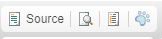
The first group are these and are described below from left to right.
| Name | Description |
|---|---|
| Source | This Source button allows you to switch to the HTML code view of the content you are adding. |
| Preview | The Preview button looks like a magnifying glass on paper and allows you to preview the section where you are working. |
| Templates | The Templates button looks like a sheet of paper and opens the available templates you can use on the page. |
| Code Snippets | The Code Snippets blue paw print button opens a list of built-in and custom code snippets you can insert on the page. |
The next group of icons, described again from left to right are below. These buttons specialize in manipulating the text.
| Name | Description |
|---|---|
| Cut | The Cut button looks like scissors and cuts text from the page and allows you to either paste it elsewhere or discard it. To use, highlight a specific portion of text, click the scissors and it will cut the highlighted text. |
| Copy | The Copy button looks like two sheets of paper and lets you copy highlighted text to use elsewhere. |
| Paste | The Paste button looks like a clipboard (the first clipboard) and is used to paste copied or cut text where you have put your cursor. |
| Paste as plain text | The Paste as plain text button looks like a clipboard with a blue notebook on it and it removes any formatting that may have been included with the copied text you are pasting. We recommend that if you copy and paste from another source, you use this button to remove formatting, then reapply formatting from the editor. |
| Paste from Word | The Paste from Word button looks like a clipboard with the letter W on it and lets you paste text you've copied from a Word document, retaining as much of the Word formatting as possible. |
| The Print button looks like a printer and allows you to print the information in the WYSIWYG field in which you are working. |
The next group of icons described from left to right are below.
| Name | Description |
|---|---|
| Undo | The Undo button is the left-pointing arrow and allows you to undo the change you just made. |
| Redo | The Redo button is the right-pointing arrow and lets you redo the change you just undid. |
| Find | The Find button looks like binoculars and allows you to type a search word or phrase into the field and find that text in the section you are editing. The popup box has two tabs, Find and Replace. The first simply finds the instances of that text, the second allows you to locate the text and replace it with new text. There are options for the search, shown below. The X in the upper right corner closes the popup box. |
| Select all | The Select all button looks like a blue square over a sheet of paper and lets you select everything within the editor. When you tap this button, you'll notice that the text in the editor is highlighted. It remains highlighted until you perform another action, allowing you to use one of the text manipulation buttons, such as copy. |
| Remove format | The Remove format button looks like an eraser and when you highlight text, press the button, it then removes any formatting you had applied to that text. |

The next group is a small group of three icons, from left to right below. These buttons all have to do with linking content into your page.
| Name | Description |
|---|---|
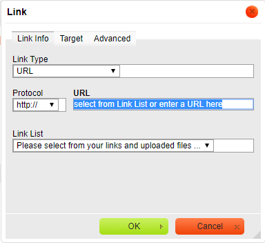
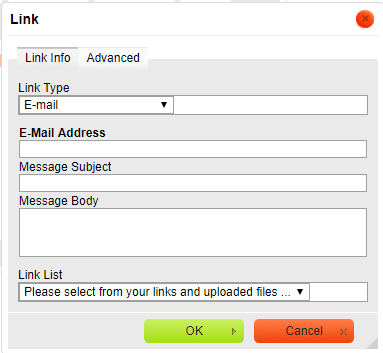
| Link | The Link button looks like a chain over a blue circle, and it allows you to use a hyperlink to link content to the text you have highlighted.
To use this button:
|
| Unlink | The Unlink button looks like the link button but is faded in color, and it removes a link from a highlighted section of text. |
| Anchor | The Anchor button looks like a flag, and it inserts an anchor, or a sort of internal (just to this page) bookmark, to which you can link other content. When used, you can insert an anchor for instance, named fee and then in another section of the page, when talking about adoption processes, you can insert a link when talking about the adoption fee. The name of the anchor is not visible to the reader. |

The last group of icons on the top row is long, and they are described below, left to right.

| Name | Description |
|---|---|
| Image | The Image button looks like a picture and allows you to insert an image into your web page. When you tap the button, a popup box opens:
|
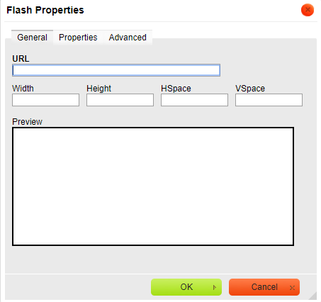
| Flash | The Flash button allows you to insert Flash animation. If you are familiar with Flash animation and want to insert one into your web page, use the tabs and fields to define how it is aligned, how large the image is, the background color, and more. |
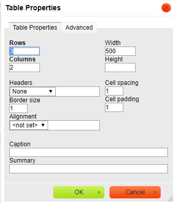
| Table | The Table button, which looks like a text table, allows you to insert a table easily. Define the table using the fields provided:
|
| Horizontal Line | The next button looks like a horizontal line, and is the Horizontal Line button, which inserts a horizontal line where your cursor is placed. It runs across the web page. |
| Smiley | The Smiley button, which does look like a smiling emoticon, opens to a menu of smileys which you can select to include in your web page where your cursor is located. |
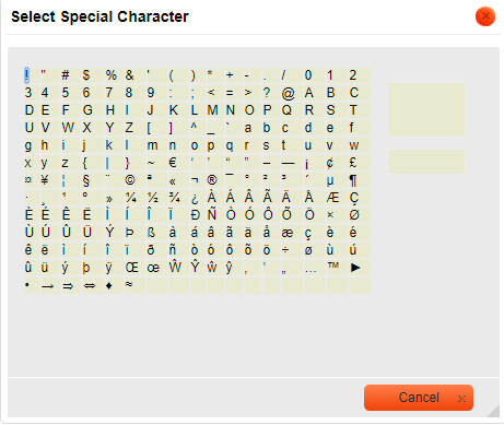
| Special Characters | The Special Characters button (an Omega symbol) inserts your selection from a list of special characters such as a copyright symbol, trademark symbol, and so forth. |
| Insert page break for printing | This button looks like portions of two documents separated by a space. This simply inserts a page break to make printing the information by page easier. |
| IFrame | The IFrame button is a blue and gray circle at the far right of this group. It is an HTML element that allows an external web page to be embedded in an HTML document. If you think you need this and are unfamiliar with how it works, open a support ticket so we can help you. |


The first group of icons on the second row of the WYSIWYG editor have to do with how your text looks and are described left to right.
| Name | Description |
|---|---|
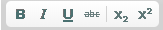
| Bold | The Bold button makes your highlighted text bold, or tap the button prior to typing text that you want bolded. Tap it again when you are finished typing the bolded section. |
| Italic | The Italic button acts in the same way as the Bold button. Tap it to make a highlighted selection appear in italics, or tap it to begin italicized text, and again to end the italicized section. |
| Underline | As with the last two buttons, the Underline button can be used to underline a highlighted section of text, or can be tapped prior to typing an underlined section, and again when the underlined section is complete. |
| Strike Through | The Strike Through button is used to highlight or type a section of text which is crossed through. You may want to use this to highlight something you do not want the visitor to type in a field or application, for instance. |
| Subscript | The Subscript button makes the highlighted or typed text a subscript. |
| Superscript | The Superscript button makes the highlighted or typed text superscript. |
The next group of icons has to do with formatting your text.
| Name | Description |
|---|---|
| Insert/Remove Numbered List | This button begins a numbered list, and as you type and hit Enter, each line will begin with a number. Tapping it again will end the numbered list. You can also highlight a numbered list and tap the button to remove the numbered list formatting. |
| Insert/Remove Bulleted List | This button allows you to make a list using dots to begin each line. It acts as did the numbered list button. Tapping it before you type begins the bulleted list, and tapping it again ends it. Highlighting a list removes the bulleting format. |
| Decrease Indent | The Decrease Indent has an arrow pointing to the left, and will decrease the indentation of a line. |
| Increase Indent | The Increase Indent button has an arrow pointing to the right and will indent a line. |
| Block Quote | Tapping the Block Quote button, which looks like a quotation mark, begins formatting the text you type into a formatted quotation block indented from the rest of the text. Highlighting text and tapping the button applies that formatting to the highlighted text, and tapping it again removes the formatting. |
| Create Div Container | This button is used by web developers to group together HTML elements. |
The next set of icons to the right on the second line have to do with justifying your content, left, right, or center, or full justified. All of these buttons can be used before typing a section, or you can justify the entire web page.
| Name | Description |
|---|---|
| Align Left | The button shows text that is aligned to the left, meaning every new line is aligned with the lines above and below it to the left. This is the most common form of justifying text. |
| Center | The Center justify button centers your text. |
| Align Right | Tap this button to align your typing or a highlighted section to the right. |
| Justify | The Justify button applies what is called full justify to the text, which might make the last line of text in a paragraph considerably shorter than the other lines. |
The next set of icons have to do with the direction of your text and their names are self-explanatory.
| Name | Description |
|---|---|
| Text direction from left to right | This button makes the text go from left to right. |
| Text direction from right to left | This button makes the text go from left to right. |
We've grouped the next few selections into one table as follows. All of them have to do with your text font and how it is displayed.
| Name | Description |
|---|---|
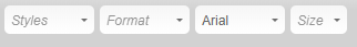
| Formatting Styles | The drop-down menu accessed by tapping the Styles button allows you to use pre-set styles, such as computer text, for your text selection. |
| Paragraph Format | The drop-down menu accessed by tapping the Format button allows you to define the heading style for your selection, from Heading 1 through 5. |
| Font Name | The Font Name drop-down menu (identified by the font name Arial in the screen shot above) applies a particular font to your selected text. If you select the entire webpage, the font is applied to the whole page. If you tap it at the beginning of a selection, your typing will be in that font. |
| Font Size | The Size button enables you to select the font size for your selection - or you can tap it before you type to apply the size to the content you are typing. |
The first set of icons on the last row of the editor have to do with color. There are two.
| Name | Description |
|---|---|
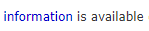
| Text Color | Highlight text, or tap before typing to select a color for your text. When done with the text you want in that color, tap the button again. This button opens a menu of all available colors, or tap the More Colors button at the bottom of the menu to select another color from the color bars. Just tap in the color bars where you see the color you want, preview it in the Selected Color field, and click OK to save it. Here is an example of making one word in a phrase a different color for emphasis.
|
| Background Color | This button works in the same way the Text Color button does. Tapping it opens the same menu of colors, and tapping More Colors allows you to select a custom color from the color bars. This background color applies only to the highlighted text, or the text you are about to type. Tapping it again after you have typed the text you want in that color stops the color from being applied. Here is an example of applying a background color to one word for emphasis.
|
The final set of icons include a link to get help about the editor.
| Name | Description |
|---|---|
| Maximize | This button looks like a blue highlighted page with arrows on each side. Tap this button and the editor you are working in takes up the full screen. Your editing menu is still at the top. Tap the Maximize button again to return to normal view. |
| Show Blocks | This button looks like a magnifying glass over a page. It reveals blocks of text formatted in the same way. Tapping it again removes the boxes around the blocks of text. |
| About CKEditor | The button that looks like a paper with a question mark opens the help menu and links to the user guide for this editing program. |
Popular Questions
Topics:
- 0votes
- 0votes
- 0votes
- 0votes
- 0votes
- 0votes
- 0votes
- 0votes
Have a question about this topic?
Overview
Content Tools