Page History
...
| Name | Description |
|---|---|
| Cut | The Cut button looks like scissors and cuts text from the page and allows you to either paste it elsewhere or discard it. To use, highlight a specific portion of text, click the scissors and it will cut the highlighted text. |
| Copy | The Copy button looks like two sheets of paper and lets you copy highlighted text to use elsewhere. |
| Paste | The Paste button looks like a clipboard (the first clipboard) and is used to paste copied or cut text where you have put your cursor. |
| Paste as plain text | The Paste as plain text button looks like a clipboard with a blue notebook on it and it removes any formatting that may have accidentally been included with the copied text you are pasting. We recommend that if you copy and paste from another source, you use this button to remove formatting, then reapply formatting from the editor. |
| Paste from Word | The Paste from Word button looks like a clipboard with the letter W on it and lets you paste text you've copied from a Word document, retaining as much of the Word formatting as possible. |
| The Print button looks like a printer and allows you to print the information in the WYSIWYG field in which you are working. |
...
| Name | Description |
|---|---|
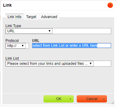
| Link | The Link button looks like a chain over a blue circle, and it allows you to use a hyperlink to link content to the text you have highlighted.
To use this button:
|
| Unlink | The Unlink button looks like the link button but is faded in color, and it removes a link from a highlighted section of text. |
| Anchor | The Anchor button looks like a flag, and it inserts an anchor, or a sort of internal (just to this page) bookmark, to which you can link other content. When used, you can insert an anchor for instance, named fee and then in another section of the page, when talking about adoption processes, you can insert a link when talking about the adoption fee. The name of the anchor is not visible to the reader. |

...
| Name | Description | ||
|---|---|---|---|
| Image | The Image button looks like a picture and allows you to insert an image into your web page. When you tap the button, a popup box opens:
| ||
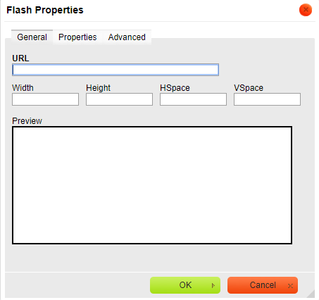
| Flash | The Flash button allows you to insert Flash animation. If you are familiar with Flash animation and want to insert one into your web page, use the tabs and fields to define how it is aligned, how large the image is, the background color, and more. | ||
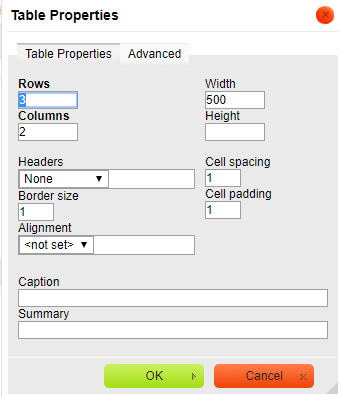
| Table | The Table button, which looks like a text table, allows you to insert a table easily. Define the table using the fields provided:
| ||
| Horizontal Line | The next button looks like a horizontal line, and is the Horizontal Line button, which inserts a horizontal line where your cursor is placed. It runs across the web page. | ||
| Smiley | The Smiley button, which does look like a smiling emoticon, opens to a menu of smileys which you can select to include in your web page where your cursor is located. | ||
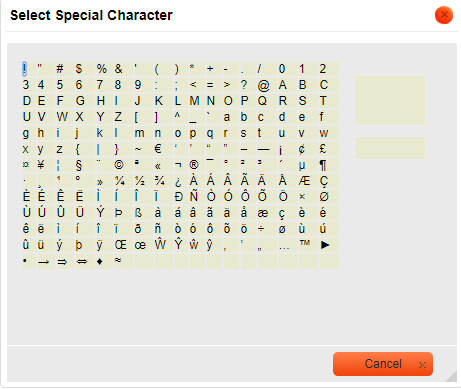
| Special Characters | The Special Characters button (an Omega symbol) inserts your selection from a list of special characters such as a copyright symbol, trademark symbol, and so forth. | ||
| Insert page break for printing | This button looks like portions of two documents separated by a space. This simply inserts a page break to make printing the information by page easier. | ||
| IFrame | The IFrame button is a blue and gray circle at the far right of this group. It is an HTML element that allows an external web page to be embedded in an HTML document. If you think you need this and are unfamiliar with how it works, open a support ticket so we can help you. |


...
| Name | Description |
|---|---|
| Bold | The Bold button makes your highlighted text bold, or tap the button prior to typing text that you want bolded. Tap it again when you are finished typing the bolded section. |
| Italic | TheItalicbutton The Italic button acts in the same way as the bold Bold button. Tap it to make a highlighted selection appear in italics, or tap it to begin italicized text, and again to end the italicized section. |
| Underline | As with the last two buttons, the Underline button can be used to underline a highlighted section of text, or can be tapped prior to typing an underlined section, and again when the underlined section is complete. |
| Strike Through | The Strike Through button is used to highlight or type a section of text which is crossed through. You may want to use this to highlight something you do not want the visitor to type in a field or application, for instance. |
| Subscript | The Subscript button makes the highlighted or typed text a subscript. |
| Superscript | The Superscript button makes the highlighted or typed text superscript. |
...
The first set of icons on the last row of the editor have to do with color. There are two.
| Name | Description |
|---|---|
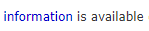
| Text Color | Highlight text, or tap before typing to select a color for your text. When done with the text you want in that color, tap the button again. This button opens a menu of all available colors, or tap the More Colors button at the bottom of the menu to select another color from the color bars. Just tap in the color bars where you see the color you want, preview it in the Selected Color field, and click OK to save it. Here is an example of making one word in a phrase a different color for emphasis.
|
| Background Color | This button works in the same way the Text Color button does. Tapping it opens the same menu of colors, and tapping More Colors allows you to select a custom color from the color bars. This background color applies only to the highlighted text, or the text you are about to type. Tapping it again after you have typed the text you want in that color stops the color from being applied. Here is an example of applying a background color to one word for emphasis.
|
The final set of icons include a link to get help about the editor.
| Name | Description |
|---|---|
| Maximize | This button looks like a blue highlighted page with arrows on each side. Tap this button and the editor you are working in takes up the full screen. Your editing menu is still at the top. Tap the Maximize button again to return to normal view. |
| Show Blocks | This button looks like a magnifying glass over a page. It reveals blocks of text formatted in the same way. Tapping it again removes the boxes around the blocks of text. |
| About CKEditor | The button that looks like a paper with a question mark opens the help menu and links to the user guide for this editing program. |
Overview
Content Tools